#1 Consulting Bootcamp in the world
Your McKinsey
Success Story Starts Here
Developed & delivered by 60+ ex-MBB consultants.
Ace a consulting interview, thrive at work, and get promoted.


Your McKinsey
Success Story Starts Here
Developed & delivered by 60+ ex-MBB consultants.
Ace a consulting interview, thrive at work, and get promoted.


Get tons of value from our free course covering 👇

Inside Consulting PART 1/3
Elite Case Solving PART 2/3
Personal Fit Key PART 3/3
Learn to think and problem-solve
like an MBB consultant

Tailored to fit your ambitions, experiences, and career goals, our interview prep adapts to you.

Unlock career opportunities in Consulting that reward both your growth and your earning potential.

Our Bootcamp can move you from zero experience to top consulting offers in just weeks.
See how we outperform the competition.
| Our Consulting Bootcamp VS | Other Interview Prep Courses | |
|---|---|---|
| Expert Faculty (60+ Ex-McKinsey, Bain, BCG professionals) Achieve unparalleled results with our pool of over 60 ex-MBB consultants, each eager to share their wealth of knowledge and insights. More about our Faculty. |  |
 |
| Comprehensive Preparation (400+ hours of content) Our bootcamp is your comprehensive guide to securing an interview, excelling in it, thriving at the job, and earning promotions quickly. More about Module 1. | |
|
| Cutting Edge Workshops Delivered on the weekend, our workshops are insightful, engaging, and interactive, offering you a direct channel for questions and live practice. | |
|
| Drills, Simulations, and Feedback Immerse yourself in a library of drills and tests, each designed to deepen your grasp of essential consulting skills. | |
|
| Leading Placement Rate on the Market of 60% With a focus on real results, our graduates enjoy an impressive 60% placement rate, far exceeding the typical 1-3%. | |
|
| Module to Thrive at Work We prepare you for more than just getting a consulting job; we equip you with all the tools you need to overcome the challenges of consulting work, ensuring you thrive from day one. More about Module 2. | |
|
| Module to Get Promoted Module 3 is designed to transform consultants into future leaders, accelerating promotions and salary increases. More about Module 3. | |
|
| Alumni Community (1000+ members) Join an exclusive community of over 1000 peers, all ready to connect, share experiences, and offer support. | |
|
| High TrustPilot Rating (4.9/5) Our commitment to excellence is reflected in our high TrustPilot rating. Click to discover what our students say about their experience with us. | |
|
| Scholarships and Flexible Tuition Payment Options Every High Bridge student has the opportunity to unlock significant scholarships and flexible payment options based on their profile. | |
|
 +953
+953At every career stage


Unmatched real-world expertise at your fingertips


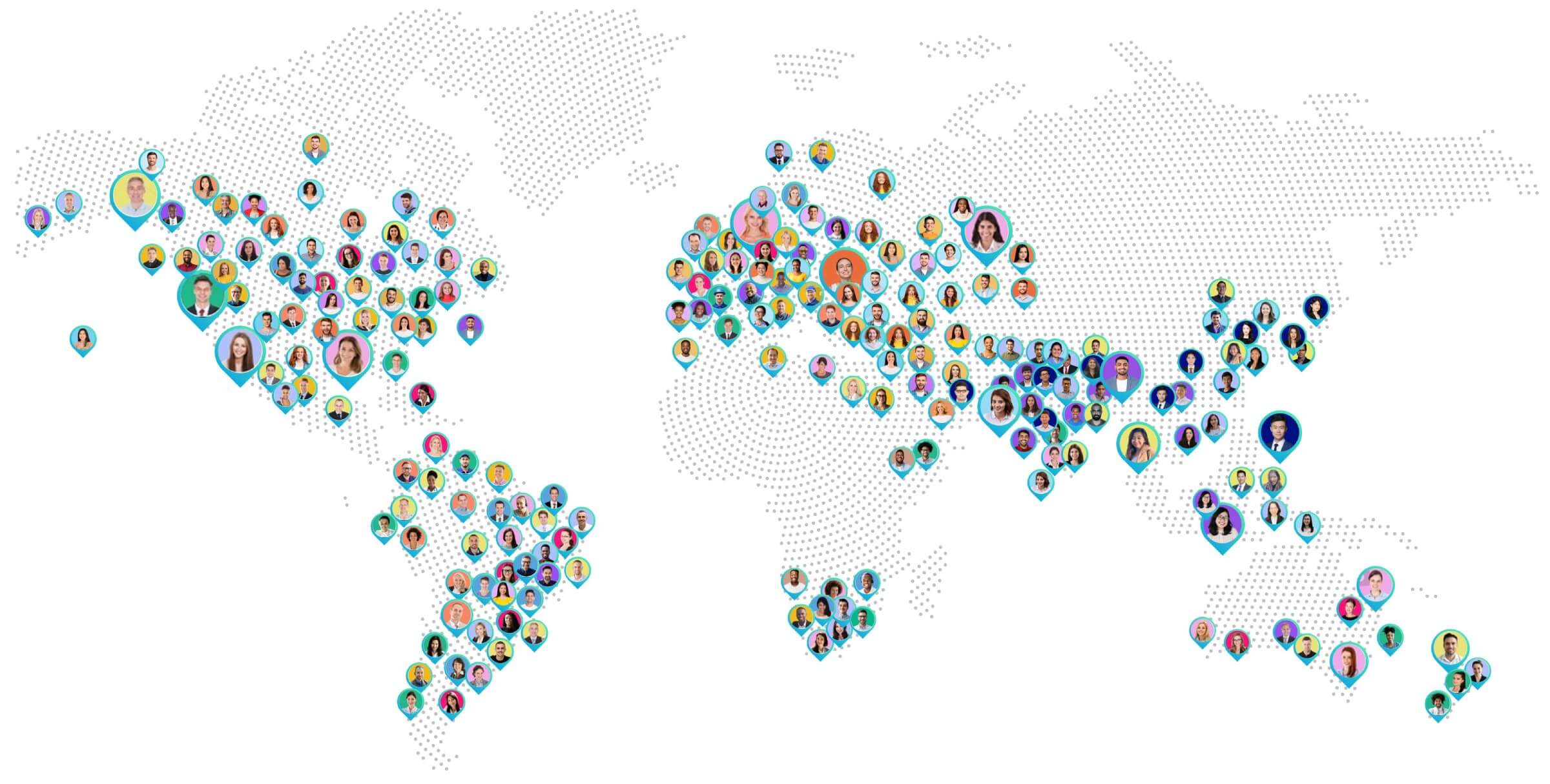
Hundreds of our Alumni have secured positions at top consulting firms


Check your interview readiness level by taking our quiz.
Crafted for deep & impactful learning


Every candidate has unique needs.
We’re here to understand yours.


